Author Archives: Priyanka Vyas

Where is the map, honey?

Last month I attended the International Geocomputation Conference hosted at University of Texas at Dallas. As a health policy researcher with a keen interest in the application of geospatial tools to solve problems related to services delivery and reduce disease burden, I was hoping to hear at least a few examples of what the next big trend would look like with the use of such tools for disease surveillance, preventing disease outbreaks, among others. However, the big trends discussed during the keynote session included applications mostly in the commercial space, while social and development sectors such as health sector trailing far behind. With increasing availability of smart phones, location based services are used commonly to obtain directions, find the nearest restaurant, or the drive time to the nearest clinic and so on. Companies like Uber, ride sharing app and community-traffic management and navigation app Waze have tapped on the location information of individuals.

But how about an app like Waze to know the waiting time and availability of doctors at crowded government or private hospitals in South Asia? Can such an app help a women who is in labor and about to deliver a child go to the right hospital instead of going to a crowded government facility, just to find that there is a long wait time after reaching there.
This is certainly utopian at this point, but it can be a possibility in the future. Health ministries in some countries have started using google map to display their health facility location information.

Here is the google application of BD hospital facilities data:
BD facilities

Brazil health facility search application
:Brazil facilities search

Argentina health ministry displays its health facilities infrastructure:

Argentina_health_infra

Several developing countries are using google maps for consumers to visualize health facilities location, type of health facilities, and the drive time to different health facilities However, in order for consumers to find utility with such visualization requires integration with other health indicators such as waiting time, availability of doctors, customer satisfaction rating, and other health infrastructure related indicators. This would help consumers make informed choices with regard to where to go for care. For policy makers, such health facilities data base needs to be integrated with information related to patient catchments i.e where are the patients coming from and for what type of services? Such information can help policy makers plug the gap in the system or identify specific locations or hot spots for certain diseases. There have been small scale initiatives ( in specific parts of some countries), mostly led by researchers and academicians in partnership with government and other institutions, but many of them have not been developed at the national level.
Most efforts to map health disparities, access, inequities come from health geographers and researchers instead of it being driven by the government and the policy planners. Hence the current scenario resembles more of a push rather than a pull strategy. To put it simply, it is more driven by supply from the researchers and academic community than it being a demand driven approach for decision making, where the health planners ask the question, “Where is the map, honey”? And only when health planners start asking such questions and demanding such information, we can expect location information to realize its full potential in the public health domain.

A marriage yet to happen: Donor coordination — from investment front towards intervention

When I took a class in International Development at Duke, one of the lessons I learnt from my Professor, who has been herself a county manager for World Bank for several years, was on donor coordination. While this was a theoretical lesson that I harbored for a few years, it was not until very recently that my own research brought me close to this reality. Lack of donor coordination has long been a buzzword when it comes to prioritizing development investments and strategies, but not much is said about the lack of coordination on the intervention front. Since I have been working on Bangladesh since the past one year, I think it is a fertile battle ground for donors investing in different projects, implementing different interventions, and producing evidence. But what is missing is connecting the dots between these different interventions:

Full vaccination districtsBelow70 districts

For example, in 2006 UNICEF identified about 14 low-performing districts to improve vaccination coverage. In 2007 WHO adopted another 23 districts that it regarded low on certain vaccine indicators. If you look at the above maps, you will see the districts adopted by WHO and those adopted by UNICEF.  Each point on the map represents vaccination coverage for a community-level of 20-30 households has been high or very low  based on the Demographic and Household Survey for Bangladesh, Historically, Sylhet and Chittgong have always had low health indicators because of hilltracts and low-lying areas. And this pattern is also evident on the map. Most of the pockets of communities with below 70 percent vaccination coverage fall in these intervention districts. The good news is that the interventions are targeted in the right geography and most communities with full vaccination coverage are outside these low-performing districts. But what can we say about communities with vaccination coverage between 80 to 90 percent and 90 to 95 percent coverage? There are several pockets of high immunization coverage in these low-performing districts and those which lie outside of these districts.

While WHO and UNICEF have been adopting districts for intervention, the Demographic and Health Surveys — which also provide GPS location data—- provide a classic opportunity to target interventions at the community level . Since district level aggregate data often mask variations in terms of pockets of low coverage and those with high coverage, location information at the community level can be a very useful tool. Unfortunately, despite all the efforts underway to collect spatial data, integrating it as a policy tool among different development agencies seems like a marriage yet to happen!

From a nose for news to cultivating a nose for geography:

As a PhD student in public policy and political economy, often my colleagues who see me working with maps ask, “Are you getting a dual doctorate in GIS (Geographic Information Systems) and Public Policy? I reply “no”. Then someone will counter argue, “But you have taken so many classes in the GIS department? Why don’t you just write their qualifying exam?”. When I still deny my intent to do so, then one of them will ask, “at least you can get a master’s in GIS”. Even during my field work in South Asia last year, few were complete surprised. One of them asked,”What is the connection between social sciences and what you do with GIS?”

So then what explains this transition from being a student of political science and studying government, public administration to my recent focus on theories in geography and my drive to acquire a plethora of tools in spatial analysis? The answer is my nose for news and I still continue to be a journalist at heart. In 2009 I left a glamorous, well-paying job at a leading financial daily in New Delhi to pursue higher education in the US. This also meant sacrificing financial comforts, and the power I could command then as a reporter to starting from scratch and making a humble beginning. Stepping down from a senior reporter’s position to making my entry as an intern and then climbing the ladder again seemed like an arduous job. But looking back 5 years when I left a career in journalism and moved into academia, my love for finding news and a story still remains the same though it now gets reflected more in my research rather than in what used to be daily writing marathons!Back in those days, I used to find news by looking at statistics and data from government reports, auto industry sales reports. Today I look at the maps and models to tell me what is the underlying story.
Division_full_coverage

Full vaccination districtsBelow70 districts

Take a look at the maps I created above. For example, what is the stark observation when you look at the above maps? Isn’t it the east-west immunization divide? Based on the division maps in the top row, one would notice that there is only one dot in the Sylhet region, and couple of dots in the Chittgong . Each dot on the map represents vaccination coverage at the community level ,comprising of 20-30 households based on the Demographic and Health Survey Data for Bangladesh, 2011. On the other hand if one looks at the division map of communities with full vaccination coverage most dots are located in Raungpur, Khulna, and Rajshahi, with few communities in the Dhaka and Barisal division. Similarly, if one looks at the district maps in the bottom row, then one finds certain districts painted in purple. These were hard to reach or low performing districts where UNICEF intervened in 2007 to raise the full vaccination coverage at the national level, according to the EPI coverage evaluation surveys. And those in pink are the 23 districts where WHO launched an intervention and continues to work in these regions. What is the obvious pattern? Most communities with full vaccination coverage are outside these low-performing districts while communities with below 70 percent immunization coverage lie in these hard to reach and low performing areas.

What is the natural question that follows after investigating where are communities with low vaccination coverage? Well, it would be a why question. Isn’t that’s where the story lies? Why is it that these regions have communities with low vaccination and vice-versa. How can I know that without really understanding the geographical context among other aspects of these regions.Development practitioners would say context matters. Geographers say location matters. Anthropologists would term this as culture matters and would view the same issue through the lens of the culture to explain certain patterns in health utilization. Then how is it that what I am doing with geography is very different than what I am doing in public policy? So from cultivating a nose for news for my journalism career to having one for geography to thrive in my academic career, I have proven once again the cliché —- once a journalist always a journalist — to be nevertheless true.

Glimpse of my fieldwork in Bangladesh, May 2014

On the banks of the river Padma. The town of Rajshahi where I visited is located close to the river.

On the banks of the river Padma. The town of Rajshahi where I visited is located close to the river.

En route to different health facilities in an electric rickshaw -- a popular means of transport to go to nearby towns and villages

En route to different health facilities in an electric rickshaw — a popular means of transport to go to nearby towns and villages


This  was a community clinic I visited in Rajshahi

This was a community clinic I visited in Rajshahi


This map was on the wall of the health care center, showing the high risk areas of Malaria and educating women on maternal and child health issues through visual aid

This map was on the wall of the health care center, showing the high risk areas of Malaria and educating women on maternal and child health issues through visual aid

Malaria high risk areas

Reaping the technology dividend to capitalize on demographic dividend

Jan, 2014:

In health, the cliché is to get rich for countries before they get old. This is mostly in the context of reaping the demographic dividend that some of the developing countries through their young and growing population. But a young and a growing population can only be a ‘dividend’ for a country if it is healthy, well-nourished, and educated – a fact quite obvious to everyone.  Despite this, the challenge for  developing countries is to reduce the geographic variation in inequities in child health and development.

Take for instance, Bangladesh.  It’s population demographic can be very favorable to its economic growth considering that the population, which is less than  15 years of age in Bangladesh, is almost 35 percent, another 56.5 percent constitutes between 15-60 years of age and only 8.2  percent of population is above 60 years of age based on the latest estimates from demographic and health survey . But for a developing country, which has a large proportion of population that constitutes children,  the challenge of improving basic services delivery in terms of health and education also remains enormous.

One such attempt to improve child health was last month when the country launched one of the largest child immunization campaign for measles vaccine Rubella.  According to the WHO South East Asia Regional Office website about 52 million children are targeted to get vaccination between January 25 and Feb 13 and marks one of the biggest campaign in the country’s history since 1979.

While this is a welcome initiative for policy-makers, public health scholars among others, a concern that continues to daunt  involved in reaching out is to improve coverage in some of the geographic regions which are difficult to reach.   There is well known evidence (Mushtaque Chowdhury et al) that there continues to be deprivation in certain geographic regions which are located in the hilly regions or in the low-lying planes.  Furthermore, for those children that work in tea-estates and do not go to school might pose another challenge for policy-makers and planners in designing interventions that can help in reaching out to this unreached population.

For example, vaccination coverage is highest in Khulna over 94 percent and lowest in Sylhet at around 80 percent, and if one may peek within districts, then one may find more variation in equities.

One such attempt to map geographic inequities was by UNICEF to construct a child deprivation index at the lower administrative levels. The deprivation index that was created out of composite set of indicators was an attempt to map the geographic variation in social indicators at the zilla and upzilla level, and provide information to policy-makers and planners as to which are the worst districts and upazillas and which ones are faring better.  Similarly, UNICEF also released the Child Equity Report for Bangladesh which maps district-level variation as well as variation within the districts on several indicators.  In addition, organizations like ICDDRL-B also integrated the use of GIS in health and demographic surveillance system at its field site in Matlab since 1990’s to produce geo-referenced maps at the village level and Bari, which is cluster of group of households which share a comman yard, according to the Health and Demographic Surveillance System, Matlab 2012 report.  However, the extent to which these geo-referenced maps are actually used in government decision-making is not much known, in my opinion.

With the plethora of tools for information at the disposal of policy-makers across countries, it seems that state failure in improving the quality of public provision of services can no longer be an option but should be the norm.


The Baptist, the Bootlegger and the Indian Health Care System


August 8, 2013:

In 1963 when Kenneth Arrow wrote his seminal piece on ‘Uncertainty &Welfare Economics of Medical Care’, it not just stirred the scholarly debate on the economics of health care but it continues to form the basis of the theory taught even in today’s health economics class.

But is this now changing? Arrow’s theory was based on the premise that unlike other goods and commodities, when it comes to medical goods and services there exists information asymmetry between consumers of health care and the suppliers— in this case the physicians and health care providers. As a result, physicians will always have an advantage in pricing as consumer cannot completely know as much about their own health needs as would a doctor.

Today thanks to information technology that this asymmetry of information is narrowing in certain countries like the US.  In the US, the government has released data for the first time on variation in hospital prices for the top 100 diagnosis-related groups for Medicare patients.  Diagnosis-related Groups is a classification system to group patients based on certain diseases and procedures incurred to treat them, thereby making it possible to compare costs for the same disease. Since Medicare is a program funded by the US department of health and human services for its citizens above 65 and disabled, the government reimburses to the hospitals a part of the cost incurred by them for conducting certain procedures, and the remainder of the amount is billed to the patient or to the insurance companies. The way the reimbursement is calculated to the hospitals is based on a variety of factors such as its labor costs and other input costs based on a hospitals location in a certain metropolitan statistical area and its characteristics. Hospital characteristics that drive variation in prices for the same surgical procedure but in different hospital setting depend on whether the hospital is a teaching hospital or a non-teaching entity, the share of the population it treats with no insurance, the share of the population it treats which have a low income and thus participate in certain safety net programs, and on ownership factors such as whether it is a government, private, not-for-profit organization among others. The government then computes the reimbursement for all the hospitals based on some of these characteristics. Thus consumers, policy makers, and employers can compare not only what a hospital charges them for a specific disease  but also can compare it to benchmark average at a state and national level. And a prudent consumer can accordingly decide his or her options to avail care, given he has the knowledge about the standardized disease code or the procedure for which he or she will be operated.

Now is this relevant in the Indian context? Importantly, can it be possible for the government to regulate the hospitals and the insurance companies in publishing this kind of data on hospital costs associated with the same surgical procedure?  Researchers at the Public Health Foundation, Chatterjee, Sushmita and Laxminarayan, Ramanan recently conducted a similar study to detect variation in hospital costs with a sample of 5 hospitals with varying characteristics such as private, district level or tertiary care among others. And any such study that could cover more hospitals by a researcher will have limitations because only the government can have the wherewithal to furnish large scale national data of this kind.

While in a country where out of pocket expenses constitute a fairly high share of overall health spending in comparison to other countries and an increased share of tertiary care and multi-speciality hospitals are being concentrated in urban settings, this kind of information can certain help consumers within the same geographical area to make better informed decisions or those travelling from smaller cities as well.  At the same time increased transparency in hospital prices could also possibly benefit the medical tourism industry clients who currently can view the nearest hotels but not compare the prices of another hospital in its proximity.

But unlike in the US where the government provides subsidies even to the private hospitals depending on their teaching/non-teaching status, treatment of low-income population or without any form of health insurance, this is not the case in India.  This also makes hospitals less accountable to the government and in complying with the latter to provide such data.

When it comes to making public policy decisions by the government, there are always two parties that favor the same regulation for completely different reasons —the Baptists and the bootleggers. The Baptist will favor a regulation for ethical reasons; the bootlegger will because increased regulation would benefit his own industry. Extending the same analogy in the Indian health care setting, the Baptist would certainly be the consumer and non-profit organization advocates who will benefit and would favor such a regulation even on ethical grounds. Who will be the bootlegger? Will it be the medical tourism industry or the health insurance companies?


Need for a standardized innovation policy index:

ADB Social Protection Index

July, 2013:

Last month the Asian Development Bank released the Social Protection Index, which ranks countries based on their welfare programs. The index is mostly based on two parameters- the depth & the breadth of the coverage. While the depth is measured based on the benefit package offered to the beneficiaries, the breadth is based on the number of beneficiaries it covers. It does so using a simple formula of dividing the total program expenditure on welfare schemes by the total number of intended beneficiaries in all the schemes in order to come up with a ratio.

Even though the index is a first step to develop a methodology towards making cross- country comparison on their welfare schemes based on certain standardized measures, the question still remains of the context. Can one country follow another country’s policy with a completely different context? And can they replicate the success of one county in an entirely different setting? This could be similar to an apple and an oranges comparison whereby one country may have different welfare scheme than the other or the time period could be different. So for example, if South Korea started in 1988 its policy to provide health care coverage to its entire population and achieved a certain depth & breadth in a specific time frame, would it be a fair to compare its ratio to another country’s welfare program ratio based on shorter time frame. Well, the ADB has tried to reduce this variation by coming up with index based on region as well as by income. Hence, countries with similar economic growth can compare how well their social protection index fares in comparison to another.

Thinking on similar lines in terms of policy innovation, there is always a question as to how is it some country has been able to deliver a policy successfully and scaled up while some others may not have been? Unlike technological or manufacturing innovation which can be measured in terms of a new product launch or path-breaking model, policy innovation can be in two instances:

1)  When a state truly launches a new program which has not been initiated before.  For example, the first cash transfer program in Latin American or a new way of financing health program or delivering a vaccine.

2)When a country is able to achieve scale that others with similar economic and political structures are finding it hard to achieve.

Considering that there are several research grants in this area and innovation being the buzzword, maybe there is lack of evidence due to which there is such a growing interest in the scholarly and development practitioner community. So if one was to come up with a policy innovation index, then, what would be the parameters to make a standardized comparison of policy or programs:

1)Time Period in which policy was initiated and launched, bringing consensus from all stakeholders

2) The scale at which it was delivered

3)The process which enabled it

One attempt to compile policy innovation in health care is done by the Center for Health Market & Innovation. They have built a huge portfolio of programs in several parts of the world and categorized their innovation in 5 areas: 1)Health financing 2)Organizing delivery 3)Regulating performance 4)Changing behavior 5)Enhancing process

But in each of the category all the programs are different in terms of their approaches. So then how do you make a comparison of which program was more successful, which were the processes followed that made it more successful while another program adopting a similar strategy would have failed.

In other words, how do we build evidence to find out what works and what doesn’t?  As Don Hicks, Professor of Research Design points out, “You really build evidence by taking the same dependent variable and the same main independent variable in different settings and then trying to assess what is leading to variation?”

This would make sense if we would like to know about a successful HIV Aids program or a Tuberculosis prevention and reduction program.  By successful I mean a program or a country that has demonstrated substantial reduction in disease prevalence or in improving overall outcomes.  If we were to take the same dependent variable on outcome measures and have the same intervention as the main independent variable across several different settings, while controlling for certain processes,  to see whether a program could be scaled or not, would be one possible way to understand which innovation in HIV aids really works. And if the same main independent variable fails to produce desired outcome in a different setting, then this would give a clue as to the institutional factors and problems in delivery of the program that made it successful or failure.

While knowing all the good and diverse recipes is a great thing, sometimes it is also useful to know a standardized recipe that works too.  If  “innovation lies in delivery”, and by delivery Dr. Hicks means scaling up, then certainly one needs a more standardized measure to compare similar programs, similar interventions, similar time period and different settings to truly know the missing gaps. Acknowledging that a randomized experiment may not be possible, this kind of comparison could possible answer to not just which innovation works but also the process associated with it.  Just as a standardized Z score makes it possible to compare variables with different units by converting it into a unitless statistic, metaphorically speaking, a standardized policy innovation index could well reduce the variation and serve a similar purpose.


Arrow & Information Assymetry

CMS_CMSWebsite_WEB.jpg

July 2013

A classic opportunity to test causality:

In 1963 when Kenneth Arrow wrote his seminal piece on ‘Uncertainty &Welfare Economics of Medical Care’, it not just stirred the scholarly debate on the economics of health care but it continues to form the basis of health economics theory even in today’s health economics class.

But is this now changing?  Arrow’s theory was based on the premise of asymmetric information between the consumers of health care and suppliers — in this case the physicians and health care providers — due to which the physicians will always have an advantage on pricing as consumer cannot completely know as much about their own health needs as would a doctor.

 However, with the increasing information on cost and quality being made available to consumers by the Center for Medicare & Medicaid seems to be bridging this asymmetry of information. In May 2013 the Centre released data for the first time on variation in hospital prices based on top 50 diagnosis-related groups. Thus consumers, policy makers, and employers can compare not only what a hospital charges them for a specific disease  but also can compare it to benchmark average at a state and national level.  Further, the Agency for Health Care Research and Quality along with other departments of Health & Human Services launched various initiatives to produce standardized measures on the quality front. The data on health quality outcomes and indicators of hospitals is becoming increasingly refined over the years as more standardized measures are being produced to compare hospitals, and increasingly more tools are being developed on this front. These are a mix of process and outcome indicators such as hospital associated infections acquired by patient, readmission rates, reduction in hospital readmission rates, various hospital care process measures, how well each provider compares at state and national level among several other metrics.

While health outcomes are a function of medical care inputs as well as socio-economic factors such as education, life style among others, a fact acknowledged not just by Arrow but also based on scientific evidence, the growing information brings a boon for consumers as well as researchers.

From a consumer perspective there is now more information to correlate cost and quality.  But it is even more interesting from a researcher’s perspective and those studying economics of health care.

The key question lies:

-How are hospitals responding to this increased pressure on publishing cost and quality data?

-How is this changing incentive structure changing the processes and quality measures?

-Is it changing the outcomes?

-How does this increased transparency in hospital data reduce the asymmetry of information?

-And what does it bring for the consumers?

This is a historic time for members in the research community – a classic opportunity for a pre &a post design or a comparative change design of two group equivalents.

The taste of pudding lies in eating, so lies the taste of any high quality research in building evidence. The time is ripe now.


Power flows from the purse strings of local governments:

Mao.jpg

July, 2013

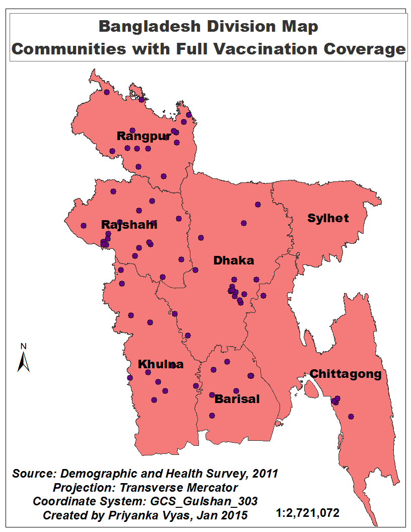
India is fast moving on reforming its welfare system by providing a unique identification number to all its citizens—  of which the biggest advantage is believed to be accrued to people who live below poverty line or who face challenges to claim any welfare benefits.  The country is targeting to enroll about 600 million people under the scheme known as “Aaadhar”  by 2014, almost double of  what the current enrollment stands at.   The entire initiative will pave the way for an electronic system to deliver welfare programs to its citizens by providing a unique identification number and track these welfare payments.

While there is little doubt that such an initiative could reduce corruption, wastages and inefficiencies in its public delivery system, the question is to what extent can India dramatically improve development outcomes based on its transformed system of delivering subsidies?  Can India replicate the success of countries such as Brazil and China in scaling up its welfare system and  being able to  rapidly deliver benefits to a large number of population in a short time frame?  China has already embarked on an ambitious program of providing health care to its rural citizens. Brazil started the process way back in 1988 when it amended the constitution in 1988.

How did these countries achieve this? What lessons can India’s “BRIC” comrades offer when it comes to scaling up its welfare system?

Institution transformation:  Formal versus Informal

China:

Under the current health care system, local governments in China spend a significant share of their budget on healthcare and social expenditures while the central government contribution is much lower. Over the years, the local governments in China have emerged to be powerful actors, both on the expenditure as well as revenue front.

But how did local governments in China become so powerful?

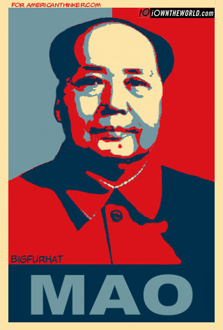
The historical context of this transformation dates back to the leadership of Mao, according to  Jean Oi, scholar of Chinese politics at Stanford. Mao’s system of setting production targets for food and industrial production institutionalized a system where each level of government contracted “targets” on the revenue front with the subsequent level of government. This spawned indirectly a system of performance-based management where the government set performance targets and tracked indicators at the lowest level. Jean calls them village governments due to the their entrepreneurial spirit.  The pressure to raise revenues and meet the performance standards from higher level of governments forced the local units to become more dynamic in their engagement with businesses.

Thus the process of institutional transformation in China was initially informal, where the system of setting performance targets and meeting them for industrial production triggered such a system  for social sector program. Today, however, local government officials’ performance is assessed not just on economic growth and industrial development in their territory but also based on human and sustainable development.  Each of this component gets an equal weight, and decisions regarding revenues transfer and bureaucratic promotions are tied to achieving these overall targets and performance benchmarks on economic and human development front according to a study on “Performance Management in People’s Republic of China: A study of accountability and vertical control in the implementation of public policy” by Burns & Zhiren in 2010.

 Brazil:

Contrary to China, the process by which the role of local governments dramatically transformed in Brazil was more formal. The 1988 constitution amendment was a major turning point in the history that declared health as a right and mandated allocations towards health and education from the federal government as well as local governments. Local governments share of public spending increased from 18 to 22 percent, almost 3.5 percent of GDP, cites an article on “Brazil’s System of Local Government, Local Finance and Intergovernmental relations,” by Souza & Celin.Furthermore in 2002 there was a constitutional amendment which required local governments to earmark 15 percent of their budgets as well as from constitutional transfers to health programs (Souza).

 Municipal elections were already taking place, but combined with their increasing clout in allocating budgets,  policy innovations began to emerge at the local level. Several innovations in governance such as participatory budgets, cash transfer programs were experimented at the local level, which were then replicated across several cities.

 India

When it comes to India a major point of institutional transformation has occurred with the National Rural Health Mission, which is changing the role of local governments or the “panchayati raj institutions” by giving them more planning powers.  Though the 73rd amendment was supposed to change the role of local governments, the process has still been gradual.  Since the Panchayat Empowerment and Accountability Incentive Scheme launched in 2005-06 and attempts to deepen the devolution process by launching the devolution index, local government’s capacity to raise revenues and spend is still very low compared to countries like Brazil and China. According to the Devolution Index in India latest report,  there has been expansion of the local government’s responsibilities in planning and execution of projects and schemes  sponsored by the central and state governments, taxes and spending powers still continue to be very low.  As of 2012-13, share of local governments as a part of state government’s revenue is still barely 1 percent or even less for most of the local government institutions. 

 Institutional transformation at local level through UIDAI:

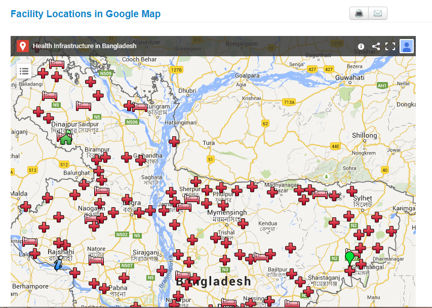
At present, UIDAI is developing a system to make electronic payments to welfare recipients and has the capability by which a government official at any level will know the status of the delivery or payment to a beneficiary.  In the future this could very well pave the way for the government at each level to track far more indicators and outcomes.  For instance, in case of beneficiaries under NRHM’s health insurance schemes for the poor,  UIDAI could make it possible to track other indicators such as utilization level of the beneficiaries, hospital admission rates, readmission rates,  duration of the hospital stay and other quality indicators for health outcomes.  And based on these indicators for the welfare scheme recipients, local governments could infuse more power in terms of getting more resources from the higher level of governments or could use the same to battle their electoral turf wars.  In Brazil, policy innovation has occurred at the grassroot level thanks to the electoral and fiscal clout of the local actors.  In contrast China lacks electoral power but strong position of local governments to spend on welfare programs and raise revenues for the central government has made  it possible to enforce accountability from the central government and rapidly scale up its welfare programs.

Mao may well have said that power flows from the barrel of the gun. Today the situation is power flows from the purse strings of the local governments.