Last month I attended the International Geocomputation Conference hosted at University of Texas at Dallas. As a health policy researcher with a keen interest in the application of geospatial tools to solve problems related to services delivery and reduce disease burden, I was hoping to hear at least a few examples of what the next big trend would look like with the use of such tools for disease surveillance, preventing disease outbreaks, among others. However, the big trends discussed during the keynote session included applications mostly in the commercial space, while social and development sectors such as health sector trailing far behind. With increasing availability of smart phones, location based services are used commonly to obtain directions, find the nearest restaurant, or the drive time to the nearest clinic and so on. Companies like Uber, ride sharing app and community-traffic management and navigation app Waze have tapped on the location information of individuals.
But how about an app like Waze to know the waiting time and availability of doctors at crowded government or private hospitals in South Asia? Can such an app help a women who is in labor and about to deliver a child go to the right hospital instead of going to a crowded government facility, just to find that there is a long wait time after reaching there.
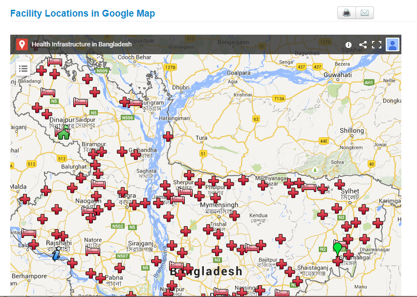
This is certainly utopian at this point, but it can be a possibility in the future. Health ministries in some countries have started using google map to display their health facility location information.
Here is the google application of BD hospital facilities data:
Brazil health facility search application
:
Argentina health ministry displays its health facilities infrastructure:

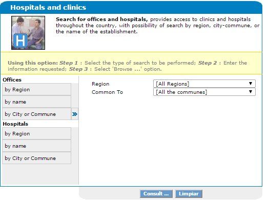
Several developing countries are using google maps for consumers to visualize health facilities location, type of health facilities, and the drive time to different health facilities However, in order for consumers to find utility with such visualization requires integration with other health indicators such as waiting time, availability of doctors, customer satisfaction rating, and other health infrastructure related indicators. This would help consumers make informed choices with regard to where to go for care. For policy makers, such health facilities data base needs to be integrated with information related to patient catchments i.e where are the patients coming from and for what type of services? Such information can help policy makers plug the gap in the system or identify specific locations or hot spots for certain diseases. There have been small scale initiatives ( in specific parts of some countries), mostly led by researchers and academicians in partnership with government and other institutions, but many of them have not been developed at the national level.
Most efforts to map health disparities, access, inequities come from health geographers and researchers instead of it being driven by the government and the policy planners. Hence the current scenario resembles more of a push rather than a pull strategy. To put it simply, it is more driven by supply from the researchers and academic community than it being a demand driven approach for decision making, where the health planners ask the question, “Where is the map, honey”? And only when health planners start asking such questions and demanding such information, we can expect location information to realize its full potential in the public health domain.